March 22, 2011 By Cheryl
One of the things I love most about using HootSuite for Twitter, is the ability to schedule Tweets.
Did you know you can also use HootSuite to schedule things to post on your Facebook page?
I’ll show you just how easy it is…………..
You need to start with a HootSuite Account and sign in.
Go to the Welcome page and click “Add a Social Network”
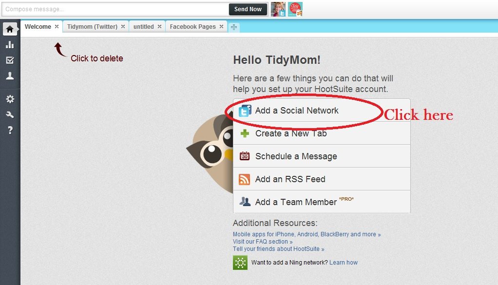
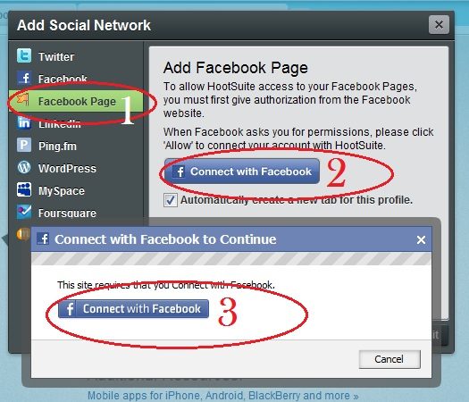
Next you will see a screen like the one below:
1. Click Facebook PAGE (not just Facebook – that is for your profile)
2. Click Connect with Facebook
3. Click connect with Facebook and login in when prompted.
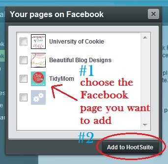
Next you will see a pop up that shows the Facebook Pages you have.
1. Choose which Facebook Page you want to add.
2. Click “Add to HootSuite”
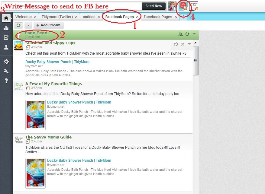
You will now have a new tab for your Facebook Page.
1. Your new tab (you can actually click that tab title and change the title name)
2. Shows you this is the Page Feed and Name
3. This is where you write what you want to post to your Facebook Page.
4. Be sure to check what profile you wish to post too (In this case, choose the facebook page profile)
*you can click Send Now to post to your Facebook Page immediately.
How To schedule something to your Facebook page at a later date and/or time
1. Write your message
2. Choose your Facebook Page Profile
3. Click the Calendar icon (calendar will pop open then)
4. Set the date and time you wish to post to Facebook
5. Click “Ok”
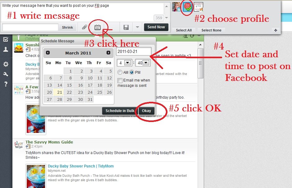
6. send now has now changed to Schedule – click “Schedule”

ADD Pending Facebook to your HootSuite Tabs
If you want to be able to keep track of what you have pending to post to your Facebook Page – simply create a new tab in HootSuite.
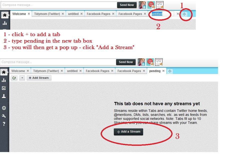
1. Click the “+” to add a tab
2. By default the new tab will say “untitled” Click the tab title to change the name. (ie: FB Pending)
3. you will get a pop up…. click “Add a Stream”
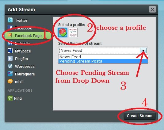
You will now add your Pending stream.
1. Choose Facebook PAGE
2. Choose which profile
3. click the drop down and choose “Pending Stream Posts”
4. Click “Create Stream”
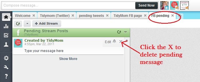
Want to DELETE a pending post?
1. click the tab FB pending
2. when you hoover your mouse to the right of the post you will see Edit – Click the ‘X” to delete the pending Facebook message. (you could also click edit, to edit your message)
Done!
Have any questions? Just leave it in the comments and I’ll try to answer them!
“Like” TidyMom on Facebook

December 16, 2010 By Amanda Padgett
Have you ever come across a wonderful craft or recipe post with lots of instructions and you wanted to print it out or save it to your computer for later use? I used to use ‘print page’ or I selected the text and chose ‘print selection.’
Not long ago a reader at my photography and Photoshop Elements blog, Everyday Elements, turned me onto Joliprint for printing posts and I love it! It is a very simple yet useful tool to make PDFs of blog posts, which you can either print or save.
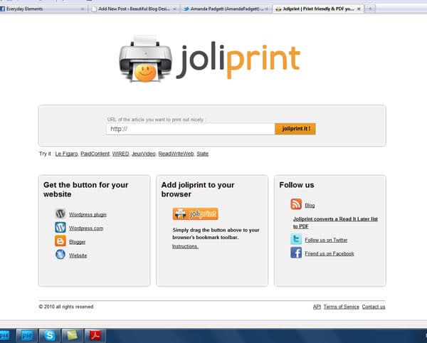
Joliprint Home Page
You can add it to your tool bar, for printing at blogs that don’t have a print option. Simply click on the icon and drag it to your tool bar. To print a blog post, you need to be in the post, not at their home site. Simply click on the post title at a blog and then click the Joliprint tool.
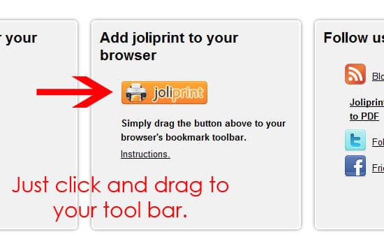
Simply drag icon to your Internet browser tool bar.
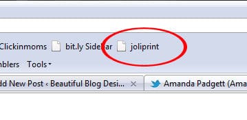
How it will look in your tool bar.
For your own blog readers use, you can add it to your blog posts by adding the plug-in or gadget to your WordPress or Blogger blogs.
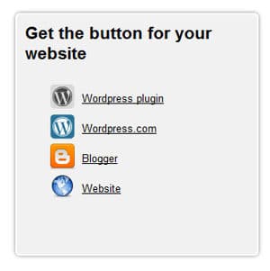
Joliprint plug-in or gadget can be added to blogs or websites.
After you have installed the plug-in or gadget, you need to configure it which is simply picking out the icon you want to use and where you want it positioned in your post. Below is an example of the icon and placement at Everyday Elements. You can see the one for Beautiful Blog Designs at the bottom of this post.
Example of Joliprint plug-in icon at bottom of post.
The PDF created is really nice, not just a plain text document. You can print or save to your computer. If you have One Note, you can save it under different Notebooks. I have separate ones for recipes, Photoshop Element tutorials, crafts and homeschooling (learning to LOVE One Note!).
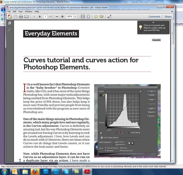
Example of a post as a Joliprint PDF to print or save.
Screen prints are nice, but even better is a video showing how to do it. Really, it is super simple, but I have learned that there are some not-so-techie readers out there, so I made the video so they can see the simple steps played out.
I used the Cinnamon Honey Butter recipe post from TidyMom as an example in the video. It is awesome and definitely worth printing and saving!
May 13, 2010 By Amanda Padgett
In the past 15 months Beautiful Blog Designs has grown beyond what I ever imagined it would or could. And, with that growth has come new responsibilities and expectations for me. Each week I get emails from bloggers or designers requesting one thing or another, and for a while it wasn’t too much for me to handle. However, I have started some new ventures (which I will share at a later date) and I need to streamline and set parameters which will help bloggers, blog designers and me.
Please, please don’t take this post for snotty or full-of-myself, because I promise that is not my intent. I just have so much else going on that I needed change things so that I can better help those asking for service.
FOR BLOGGERS:
If you are a blogger, no matter the platform, and you would like me to recommend a designer for you, please copy the following questions in an email and supply your answers in a different color. I will respond as soon as possible (will vary from 24 hours to a week).
- Do you need a full design or just some tweaking?
- What blogging platform do you use or would like to move to?
- What style would you prefer (scrappy, modern, shabby-chic, etc.)?
- How much are you willing to spend? Less than $100? Between $100 – $200? Over $200?
- What is more important to you – speed of design & launch or quality, i.e. do you have time to wait in a designers queue or do you want something quickly?
FOR DESIGNERS:
If you are a designer and you would like to be listed at BBD, please send me an email with the following:
- Your design studio name
- The URL address to your site
- What blog platforms you design in
- What lists you would like to be placed on (free templates, free backgrounds, premades, custom, etc.)
If you are a designer and would like me to publicize a giveaway on the giveaway page, please send me an email with the following:
- The exact HTML code in a TXT document, with the following information:
- Your linked button
- The giveaway item (and value)
- The giveaway end date
- Where to enter
I would like to keep the Giveaways page more up-to-date than I’ve been able to in the past six months and if you (designers) can send me that above information in a TXT document, I can easily do so.
If you would like to a sponsor spot on BBD, please email me. All the spots are currently taken, but I will add you to the waiting list and notify you when an spot comes open.

January 27, 2010 By Amanda Padgett
Guest post by Marianne
Hi there! My name is Marianne and I blog about my life, my creative adventures and my love for nesting at Songbird. I am a DIY girl, who loves to get her hands dirty and experiment with power tools. I am also DIY when it comes to blog design. A couple of months ago I gave my blog a total makeover and Amanda invited me, after giving my blog design her two thumbs up (thanks Amanda!), to share some of my insights and experiences with homemade blog designing.
We home and craft loving gals are a visual bunch, aren’t we? We want our homes and creative products to be as beautiful as possible. And since our blog is our home on the web, most of us really want our blog to be as eye pleasing as possible too.
Of course there are many talented and gifted women out there who have specialized in giving your blog a makeover and making it really beautiful. But rightfully so, these women like to get paid for their creative talent and their hard work. If you are like me, a hobby blogger whose blog doesn’t generate any income (yet), paying someone to work on your blog may not really be in your budget. So you are left to you own devices to make your blog more beautiful. And trust me, it can be done!
But before we dive into the world of blog templates, HTML coding and navigational bars, lets do some groundwork first. Just like when you are considering to give a thrift shop find a makeover: before you can get your paintbrush out and decide on the paint color you are going to use, you have to consider the way you are intending to use the piece, if it is needing repairs and how many layers of old chippy paint and dirt you have to remove first.
The same principle applies to blog design. Before you start concentrating on the pictures you are going to use in your header and the color scheme of your blog there are five things you have to think about first:
1. Your blog is for your readers.
I know you are all tempted to say ‘no I blog just for me, because I like it’. But lets face it girls if we really only blogged for ourselves we wouldn’t make our blog public, we would keep it a private (online) journal. We all want other people to read our blog and admire and enjoy our hard work. So whenever you are considering doing anything to your blog, ask yourself first if that will make the blogging experience for your readers more pleasant. Your blog design should include all the elements that make your blog really useful and usable to your readers.
2. What does your blog mean?
I think if you asked most women in our home and garden blog niche why they love blogging they would answer two things: because of the inspiration it gives them and second because of the community it makes them feel a part of. You and your blog are part of that community. So your blog design should be aimed at showcasing your projects and ideas, so that they provide maximum inspiration (lot’s of BIG pictures is one element of this) and at the same time give your visitor’s a sense that they are truly welcome and that it is fun visiting with you.
3. Clutter is clutter, even when it is the online kind.
Ever wonder why those pictures in design magazines always look so beautiful, even when they do not resemble your style? It is because of the lack of clutter. You might see a carefully draped blanket somewhere, or a casually forgotten book on a chair (with a coordinating cover color of course!), but you will never see hundreds of knickknacks, leftover breakfast dishes or dirty socks in those pictures.
If you consider the blog designs you like best, I bet that they are pretty clutter free also. There are so many gadgets, and widgets and funny buttons available to add to our blogs these days. It is really tempting to fill up your sidebars with all of them. But often they are just clutter. Clutter that is distracting your readers from your content and might even make your blog really slow to load. So when considering to add another cutesy button remember the first rule: your blog is for your readers, will adding it make you blog more useful or usable?.
4. Your blog is a reflection of you.
When I started to give my blog a makeover I started the way I start any project. I looked at the way others have done it. So I started to make a list of blogs, whose design I liked and then I started to break it down. What kind of layout did I like best, which banner drew me in the most, when did the size of the font or the pictures feel too small, which elements did I find very useful (or annoying). And then I started to try and incorporate those elements in my blog (or in some cases remove them from my existing design). When I thought I was nearly finished I asked a friend for her opinion and her reply made me almost start over completely. She said, “I like it, it looks very good, but it doesn’t look like you anymore”. And she was right, I was making a blog design like all the others. It wasn’t ‘me’ anymore. So I worked on it a lot longer, making it less like a beautiful online ‘house’ and more like my personal online ‘home’.
5. Embrace the challenge, but keep it real.
If you would have unlimited time you could make your blog the most beautiful blog in the world. There is always another design element you could add, a functionality you could improve or an opportunity to add even more beauty to your design. But if you did that, you wouldn’t have any time to blog anymore. And no matter how beautiful the design of your blog is, people come to visit you for your content. Content comes first, design comes second. So do step into the world of HTML coding, it is not as difficult as you might think, but keep your expectations real. Fiddling with your blog design can be addictive (ask me how I know that) but if it starts to interfere with your actual blogging it is counterproductive.
Marianne@Songbird is a DIY girl all the way even when it comes to blogdesign. She shares her successes and mistakes in her DIY attempts to make her Songbird blog more beautiful.
December 22, 2009 By Amanda Padgett

This is something I did a while ago, but never thought about making a post or tutorial out of it, until I was reading a friend’s blog this morning. Sharon, at Good, True and Beautiful, did a post a few months ago on how to make your Blogger profile a little spiffier.
I have multiple blogs: my personal blog, Moving Forward, BBD, a blog for my Usborne business, one for my Classical Conversations homeschool (private) group, a photography blog that I’ve long neglected and a few test blogs. I don’t want everyone seeing my “blog clutter” so I hid those other blogs.
Sharon did a wonderful tutorial on how to do just what I did. If you have a few extra blogs, like those for playing around with your template (but not if you have a custom one because that is a no-no), this is a great tutorial to follow.
Special Note: When you go over to Sharon’s site, you need to ooh and aww over it. She is another talented do-it-yourselfer, doing all her own blog design work. I first discovered her blog when she asked me to do a private blog critique. She had a great blog already, but was very receptive to the few changes I suggested. Her blog continues to grow and blossom every day! It really is “Good, True and Beautiful.”

December 18, 2009 By Amanda Padgett
Okay, I hope this comes as an intervention for some bloggers, but please know that I write this post with love.
I visit a LOT of blogs in the “Blogosphere” to find new designers and “beautiful blogs” to feature. More often than not I find blogs that have fallen prey to many design pitfalls. So, I am going to list a few steps you can take to spiffy up your blog so that more readers stick around.
- Center up the buttons on your sidebars, please. It is so easy to do and it will make your blog look so much better.
- Simply go to the gadget with that HTML code for the button and add < center > to the beginning of it and < / center >to the end of it. (Take out the spaces I added so that this post wouldn’t be centered.)
- If you don’t like any to be centered, rather left-justified then go into the gadgets with the button that is centered and take out the the < center > and < / center > that was added to the HTML by the creator of the button.
- Get a free, premade or custom design for your site. It hurts my heart when I go to someone’s blog and they still have the generic Blogger template up. There are too many options out there to not give your blog a face lift. You need help with that, please leave me a comment and I’ll walk you through it.
- You don’t have to get a fancy or elaborate blog template, just getting a custom header will bring a boring blog to life. See the Mulberry Spot to see what I mean. Or, customize your header font like I did at Hollywood Photography (my long forgotten photography blog).
- Make a link list post for the hundreds of sites you have linked on your blog’s sidebar. This is so easy and will really tidy up your sidebar so much!
- To do this simply create a post called “Links” or “Friends” or “Places I Go” or whatever you want to call it. Then copy all the links into that one post.
- After you have the post created, add a list or link list gadget to your sidebar. Title is whatever you decided on for the post title. Then add the URL address of that post to the link.
- An example of this is at my personal blog, Moving Forward. I have a “Categories” list that links to one post or several posts.
- Make the font on your blog one that is easy to read, both in style and size. I have stopped by some blogs that had the font so small that I couldn’t hardly read it.
- Another step in making your posts easy to read is to add paragraph breaks. If I stop by a blog and they have a post that is one long paragraph, I click right on out. Break up what you are writing about into several small paragraphs.
- If you try to add paragraph breaks but they don’t “stick” then go into the HTML code part of your post and add < p > or < br > where you want the breaks. (Take out the spaces I have added.)
- Another step in making your posts easy to read is to add paragraph breaks. If I stop by a blog and they have a post that is one long paragraph, I click right on out. Break up what you are writing about into several small paragraphs.
- Clear out some of the ads you have on your site. Some blogs have so many ads, both on the sidebars and in between posts that it is hard to see where the actual posts are. Very distracting, very busy.
Here are some posts by other bloggers, about what to do or not to do concerning your blog.
Ten Blogging Mistakes by Darcy at My 3 Boybarians
Blog Design: Keep it Clutter-Free and User Friendly by Melanie at Blogging Basics 101
Basic Blog Design Principles by Karla at Modern Media Mom
December 11, 2009 By Amanda Padgett
Since I just went through the process of getting a custom blog design for the third time, I feel like I know enough about the steps to share them with you. Hopefully it will help equip new bloggers for their first design, and help designers by working with better prepared customers.
Step One: Finding the Designer
Once you know you want a custom look for your blog, the first step is to find the designer you want to work with. Don’t rush into a contract with the first designer you come across. Instead, look at several designers before deciding on one, and here are the things to look for when shopping designers:
- Portfolio – do they do the style of design you want? If you really want a modern look for your blog and all they design are scrapbook style blog, then they may not be the best designer for you. Also, are the blogs in their portfolio pleasing to you? Are you impressed with her work?
- Prices – these will vary depending on the designer’s skill level and experience. The more experiences, highly trained designers will demand well over $100 for their work. The more self-taught, still-developing-their-skills designers will price their designs anywhere from $30 to $75.
- Waiting list or “queue” – this is how many bloggers they already have contracted to design for. If you are in a hurry for a new design and the designer you are looking at has a waiting list that reaches until March, then keep shopping.
- Policies – these can be different things, like how many revisions to the design they will do, which images you have to pick from, how many changes you can make after a design is installed. Most designers are very reasonable and set policies to protect themselves from being taken advantage of by needy bloggers who change their mind too much.
Step Two: Get a Vision for Your Blog
Before contacting the designer, look around for blogs you admire, both in the designer’s portfolio and around the Web. Decide what you really want or don’t want. Write down the URL address to blogs you like.
Don’t expect a designer to create a design exactly like a blog you show her. Not only does she want to create something original, exactly duplicating another blogger’s design is wrong and akin to stealing.
It is acceptable, however, to use another blog for inspiration. Your designer may use similar effects to achieve the design you invision, yet stay far from the original blog’s design. For example: I was very fond of many design elements used at A Soft Place to Land, and we were able to get some of the same effect for BBD using different images. You would not come here and think you were there and vice-versa.
Things to think about are:
- What style do you want? Scrapbook, modern, shabby-chic
- How many columns do you want for your blog? One, two, three?
- Do you want a menu or navigation bar?
- What style font do you like?
- Is load time a factor for you? Some backgrounds take the longer to load.
- Do you want post dividers, sidebar dividers, other design elements?
Step Three: Contact the Designer
Once you know the designer you want to work with, know the look you want for your blog, then you contact her to place an order.
- Follow whatever procedure they instruct you to on their site. Some just have you email them, others have you copy a questionnaire to paste into an email, and have you answer the questions in that email.
- Make sure to fill out the questionnaire completely, including any pictures or images you want used (like a picture of a child you want put in your header). Sending those at a later date makes more work for the designer as she will have to sift through emails to find the “pieces and parts” you want for your blog, rather than just opening up the one email that should include everything.
- Pay the Paypal invoice they send you. This will secure your spot in their queue. They will invoice you for either all or half their design fee. (I have worked with two that require a deposit and one that required full payment). The final invoice will be sent after the design is final; you’ll be invoiced and must pay before they install it on your blog.
- Watch your spot on their queue. Don’t pester them with emails about when your turn is coming. Most all of them have a waiting list on their sites which you can keep track of yourself. Also, make sure that you are ready for when your design comes up. If you see that you’ll be on vacation, contact her so that she can move you down and another blogger up.
- Check your email often. This is VERY important through the whole process! They will be contacting you only via email, so stay on top of it. If they have a question for you and you do not respond in a timely manner, they will place your design on hold and go on to the next customer. This is their business and you are holding them up from another job.
Step Four: Designing the Blog
The first thing your designer will do is look at the questionnaire you filled out about what you like, don’t like, what blogs you like the look of, what styles you like, etc. Then she will create a first draft based on those answers. She will notify you, with an address for you to view the design. Once you see it, do the following things:
- Really look at the design. It may not be exactly what you envisioned or it may be nothing like you envisioned, but give it a few minutes to register for you. Then, pick out the things you DO like about it (if it isn’t want you want as a whole) and write them in a reply email to the designer. She will keep those effects while revamping the rest. Maybe give her some ideas in your reply so she knows better the direction to go in.
- Example: When I was having a new design made for Moving Forward, Summer’s first draft was nothing like I envisioned, but there were a couple of things I liked about it. She kept those and then scrapped the rest. Her next version hit the mark much better.
- Be concise about changes you want made. If you love the first draft but need a few changes, list them all out in ONE email. Take your time before sending the email so that you have a chance to think of all the little tweaks and changes you would like. I am sure it is irritating to a designer to get 10 emails listing tiny little changes; put them in one email.
- I struggle with this one, so know that it is an easy mistake to do. Bless Erin’s heart!
- Compare Browsers. If you use Internet Explorer, be sure to look at your new design on Firefox and vice-versa. Sometimes the design won’t “lay” right, and the designer will need to modify a few things. This step is necessary because your readers may be using a browser you are not and if your site is all quirky and out of sink, they won’t stick around.
- Don’t be too picky. Yes, you paid for a custom design, but don’t nickle and dime your designer to death; they can only do so much. If you paid $500 for your design, then you probably have more room to be ultra-particular about everything, but if you paid $55 for your design, be respectful of your designer’s time.
- Example: The swirly font in my new design was a little two swirly for me. Erin gave me some other options, which didn’t suit me either and rather than have her spend more time searching, I stuck with this one, and I have since grown to love it!
Step Five: Making the Design Live
After the designer has made all the revisions you asked for and you are content with the final look of the blog, she will ask you for your ID and password to your blog. Or, you can make her an author to the blog and she will be able to go in and install that way. I have done it both ways and they work fine.
Things to remember during this step in the process are:
- Decide on a time when you want it installed. You will want to be around when it is so that you can move things around because some gadgets and text will be displaced during the transition. I call this time “unpacking.”
- Example: I asked Erin not to install until the afternoon, when I would be home to “unpack.” I didn’t want the site to have things look out of place or in weird spots (to me).
- Be timely about back-end changes. If there are things you notice that need changing, email her right away, while she is still “on” your job. Don’t come to her three weeks later and say “oh, by the way, can you change…”
- Things to look at are spacing of the text at the margins and sidebars, even in the comments. Those are often overlooked by bloggers during the process.
- Acknowledge your designer in a blog post. She has worked hard for you and word of mouth is one of the best forms of advertising in their line of business.
- Do NOT change the design. The blog template your designer has created is their creation, their name is attached to it. When you tamper with it, while keeping their name on it (usually in a button on the side or at the bottom) you may inadvertently put them at risk for legal trouble if you add an image that is not legally yours to use (usually done without knowing). If you wish to change something, first notify them.
Phew! That is the longest post I’ve ever written. I sure hope it proves useful! And, whoever wins the custom blog design I am giving away this week should read over steps two through five to make the process easier from herself and for Erin.
Designers – If you think of something you would like me to add or change, please contact me.

January 24, 2009 By Amanda Padgett
For more helpful posts on blogging, click on “blogging help” in the label cloud in the sidebar.
For tutorials on various blogging topics, go to my Tutorials page.
Here are some other places to get answers to your blogging questions.