
This conference will focus on inspiring, teaching, and expanding the knowledge of those who attend.
Speaker and Sponsor Proposals are now being accepted. Use our contact form to inquire.

This conference will focus on inspiring, teaching, and expanding the knowledge of those who attend.
Speaker and Sponsor Proposals are now being accepted. Use our contact form to inquire.
November 6, 2012 By The Blog Designer Network
Just a few months ago we signed up with Passionfruit Ads, and had to share this cool system with other bloggers who are interested in monetizing their own sites simply and easily. It has saved an incredible amount of time and energy managing ad spots and keeping track of sponsors.
For example, on our site there are three areas in which you can advertise. The top sidebar is the Premium option, the bottom of the sidebar is the Standard option, and (new!) you can also elect to appear in the footer. Passionfruit provided a code to paste in these widget areas, and when a new sponsor signs up, their ad automatically appears. Sign-up is simple too! Click over to our advertising page, where we’ve pasted the code Passionfruit provided. All your ad spots and prices are clearly displayed!
The entire process is easy and automated both for the sponsor and the blogger/site owner. Also, the fees for the service are small, simple, and based on how much you sell.
To celebrate this cool new system, we’re having a special sale for ad spots on The Blog Designer Network! Check out these reduced rates, and head over to Passionfruit Ads to monetize your own blog!
We apologize, refunds or rebates are not available for those who already purchased ads.
May 1, 2012 By The Blog Designer Network
May’s featured designer is Amber at Zany Dezines!

Zany Dezines started with Amber and her mission to provide fellow bloggers with new and creative designs that were both fun and affordable. After falling in love with web design in high school, she’s taken her love of making things pretty to the blogosphere!
Determined to master her craft and further drive her passion, Amber is currently working towards a Multimedia Technologies degree in Web Design at Rasmussen College. On her personal blog, Ambers Life, she shares recipes, blog designing tips and stories about college life, family and her dog, Cali.
Here is what some of her former clients had to say in their nominations.
She is an amazing talent to work with. She took my vague ideas and turned my site into a place I even love to visit! Its fun and bright yet still appealing. I have had work done by a couple other designers and Amber is by far my favorite!!!! I have also had her design my logo for another business and plan to work with her more in the future. Amber is always pleasant to work with, sends timely responses, and is friendly and helpful too! Anyone that works with her will for sure be a client for the duration — Jacque Stanwood, Get 2 Scrappin’
I gave Amber the photo used in the header and a set of colors to use…she came up with everything else! My last design was nice (not done by Amber) but I think my new design is IMMENSELY better! She was able to take just a few pieces of information and turn it into a perfect reflection of my personality. In addition to the main design, she did quite a few blog buttons for me and everything just came together wonderfully! — Jackie Snow, Lessons Learned
I have worked with Amber on numerous projects! She is a very creative & talented Web Designer, she always gets my vision and creates really fun and unique websites. I always come to her and Zany Dezines anytime I need something designed, even if its only a Twitter Background. Amber is always expanding her talents by learning new techniques and thinking outside of the box. She is bubbly and a real gem to work with! She rocks my socks! — Megan Hendershott, The Higgins Family Happenings
I absolutely love the fact that I only gave Amber a few ideas and she came up with my blog design all by herself. She is so good at listening to the client’s ideas and giving them her own spin. She is also very patient. — Jayme Weiden, The Random Blogette
Here are some examples of Amber’s work:
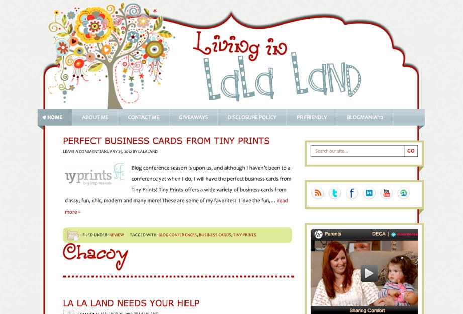
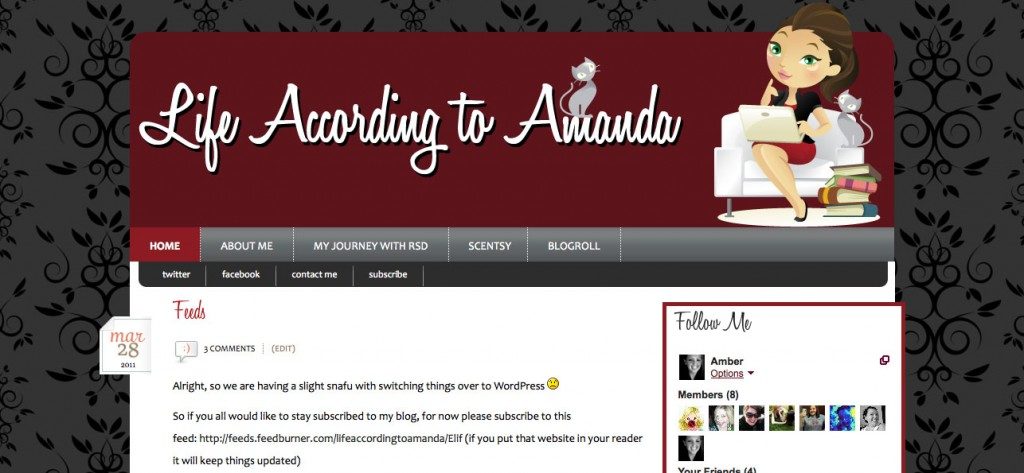
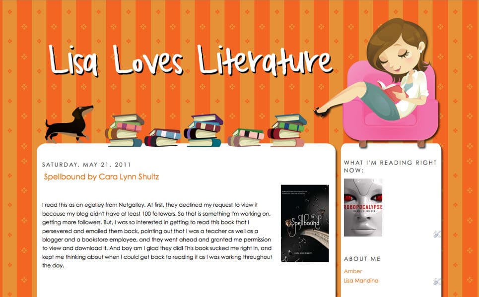
You can follow Amber on Facebook and Twitter. Be sure to check out Zany Dezines!
April 3, 2011 By Julie
WordPress and Blogger both have advantages and disadvantages. I could argue both, but that’s not what this post is about. The fact is that many people find Blogger to be a more user-friendly platform but find WordPress less limiting than Blogger. The compromise? A WordPress theme that has been modified to Blogger. There are a number of these themes hanging around Google, but I am about to introduce you to one of my favorites which is called the Revolution Lifestyle template. An example of this template can be found here: http://revolutionlifestyletemplate.blogspot.com/ The blog template is free but is rather basic. This premium template can be downloaded from magznetwork.com for $25 and allows for unlimited use. Beyond the striking organization of this template, the following options are available for use in this template: a smooth slider for featured content, video, automated lists of specified labels, drop down menu, favicon, an optional 3 column footer and more.
The CSS is rather intimidating upon first glance; however, the Magazine Network does a nice job of explaining everything and offers a screenshot of the dashboard with labels corresponding to the CSS, making customization pretty simple. Speaking of customization, there are two options when downloading the premium template: images mode and colors mode. I have used both and even with a background in CSS and HTML found colors mode infinitely more user friendly and easier to customize.
Who would benefit from this template? Blogger users who are nervous about using WordPress, bloggers who have a lot that they want organized (review and giveaway bloggers, for example), bloggers who use tons of labels that they want more organized, bloggers who want seamless features like a featured content slider, and/or bloggers who want a streamlined look.
Do not be fooled. While this template is streamlined, I have seen (and created) some pretty neat designs with this template.
One should be warned that this template is not without flaws. Many of the tutorials, which you obtain access to upon purchasing the premium template, have the statement: “Save and see if it works for you”. I have to say, though, that I have never encountered a problem. I haven’t found their forum to be particularly helpful either.
Don’t let any of that hold you back, though. The template really is a great compromise if you’re a Blogger user or designer looking for a professional, streamlined, and organized template!
November 5, 2010 By Dawn Farias
Happy Friday, friends! I was customizing my personal blog a bit and wanted to move the date from above the post title to below. I was pleased with the results and thought I’d share with you the tutorial I found for it as well as my extended customization.
This is a fairly easy and straightforward customization. You will have to get in there and edit your template’s code but it’s not scary! This tutorial was written for Blogger’s layout templates launched in 2006. I am using the Simple template that was launched earlier this year which gave me a misalignment between the post title and the sidebar title to the right.
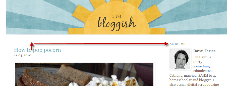
To improve the situation, I went back into the code and made the following change:
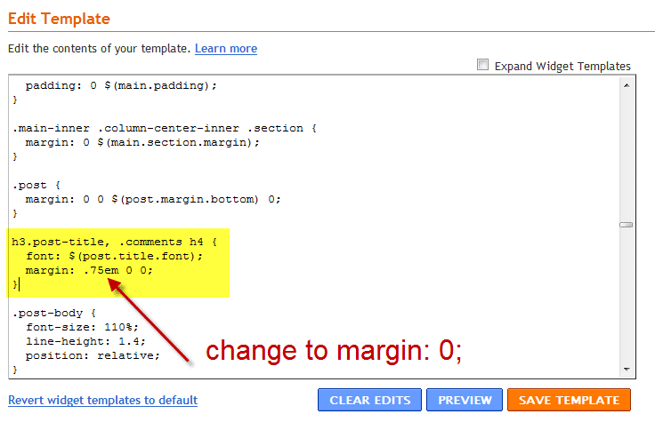
Find the h3.post-title section and change the last line FROM margin: .75em 0 0; TO margin: 0;. This helps align things a little better. Click ‘Preview’ to make sure nothing’s broken and everything looks alright. If it does, hit ‘Save’ and you’ll get something like this:

January 23, 2012 By April at CreativeGirlMedia.com
We’re so excited to launch more classes than ever this February! From newbie design classes in Photoshop Elements, to advanced PHP coding in WordPress. Check out the entire list of courses via the catalog.
Next, we also want to announce that we are having a Twitter party TONIGHT using the hashtag #BDNparty. It will last from about 6pm-8pm Pacific Time (that’s 7-9pm Mountain, 8-10pm Central, 9-11pm Eastern.) We’ll be talking all about…whatever we want! Topics will range from designs and designers we just LOVE, blog design how-to’s and tips, what makes great design, and so much more! You’re welcome to join in, and be sure to follow @the_bdn so you know when the party kicks off!
Last but certainly not least, it’s time to announce the winners of the HUGE giveaway we had this month! Winners were chosen at random from the number of valid entries.
Font of Choice from MyFonts.com Katelyn Brooke Designs
20 Credits from iStockphoto.com DIStherapy
Genesis Theme Framework from Studiopress Vanessa
$25 Gift Certificate to MyGrafico.com christine
6 Months of Hosting from BlueHost.com Jaimie
Complete Blogger to WordPress Transfer pharmgirl
500 Business Cards from Overnight Prints April
6 Months of Sponsorship at TheBDN.com Elsa M
2 Full Hours of One-on-One Training Katie Price
$150 Toward the Purchase of ANY Class Registrations ModernMuse
Winners will be contact via e-mail within 1 week, or you may claim your prize by e-mailing us directly. Unclaimed prizes will be given to another winner chosen at random. Please allow up to 1 week to receive your prize, promotional code, or certificate via e-mail. If you did not provide a valid e-mail, we will do our best to contact you via social media.
Thank you to everyone who entered for supporting the Blog Designer Network! We hope to have even more awesome giveaways in the future!
January 17, 2012
10:11 am
New Member
Forum Posts: 2
Member Since:
January 17, 2012


I’m wondering if I can do my online graphics using only PSE and not investing PS?
I understand Illustrator is another story, that it can do a lot more and has different abilities … but for graphic design is PSE just as good as PS?
January 18, 2012
3:49 am

New Member
Forum Posts: 1
Member Since:
December 28, 2011


PSE is good to begin with but I would recommend saving for PS. There is also pixlr which is like photoshop but free.
Here is the link http://pixlr.com/
January 25, 2012
6:39 pm
Member
Forum Posts: 5
Member Since:
June 18, 2011


PSE is good to start with but once you get comfy with it i would save up for PS cs 5
February 8, 2012
12:38 am
Admin
Forum Posts: 23
Member Since:
February 4, 2011


Photoshop is probably the best investment you could make as a designer (over illustrator). However, Photoshop Elements has been widely used by many designers and works just fine. If you plan on pursuing it full time, we suggest making that investment later on…after you have made income from your business!
May 20, 2012
4:36 am

Amsterdam, The Netherlands
Member
Forum Posts: 3
Member Since:
May 20, 2012


I think photoshop is such a worthwhile investment if doing graphic design work (especially for the web). There are so many little things in Photoshop that make your life easier compared to Elements. For example, Photoshop contains some great web-features like roll-over support and slicing that is lacking from Elements. I found a really great article comparing the two on About.com
A great open-source alternative to Photoshop (not Elements) is Gimp and I can strongly recommend it.
August 29, 2012
2:22 am

Pait
Guest
September 13, 2012
2:33 am

Latrice
Guest
September 13, 2012
8:50 pm

Latrice
Guest

8
Awaiting Moderation
Bringing a taste of the coach outlet online to the Stage at coach factory, coachfactory wowed us with color, prints and skin-baring pieces from Coach Outlet Online collection.Check out our entire calendar of online sample sales. Shop our guides to the best designer Coach Outlet and the best jeans.You get your dose of discount coach purses cheesiness thanks to the plastic-y material (admit it, it’s fun to get a little tacky); then glistening crystals, crisp jewel clasps, and satin Coach Handbags Outlet refine the look for a cool juxtaposition. We all know that water is the most essential drink for the insanity video and look of your skin. Coach outlet is filled with minerals that’s good for your skin and hydrates it while the essential coach outlet store online that moisturizes it as it exfoliates to become soft, silky skin.At some point “coach outlet style” referred to stylish people wearing their own clothes that they bought and put together in outfits themselves and then just went about their business.Coach factory has been making the rounds on Coach Factory. We think it would be better for our dating prospects to advertise our love of felines in a slightly more subtle way. Join our shop.coachfactory.com and http://www.coachoutletonlineftc.com/ coach outlet online list for exclusive fashion updates. this is a cool alternative to those camo print parkas that you’re starting to see pop up.
September 15, 2012
3:14 am

Lefty
Guest
September 17, 2012
3:05 am

Johnavon
Guest
September 23, 2012
2:33 am

Jeneva
Guest

11
Awaiting Moderation
Hi Nilesh, Part 3 tomorrow, will explain in more detail how to take the exported files to Dreamweaver, and what to do with them in there.When you export from Fireworks, Fireworks essentially chops up your JPEGs and arranges them in HTML Tables on a web page. Fireworks also adds in all the Javascript needed for the rollovers.What we then do in Dreamweaver is to tidy this up, add in the background and upload it to the internet for the client to see.If your question was more specific, please specify.
valtrex viagra
October 5, 2012
7:52 pm

cheap prada shoes
Guest

12
Awaiting Moderation
The importance of good and innovative design remains integral to Discount prada shoes and as designers we are encouraged to pursue bold, creative ideas and build on the company’s strong reputation,countless of customers appreciate our designers design style,so our prada shoes holds an enormous market,i hope our prada shoes has a good prospect. http://www.cheap-pradashoes.org
New arrive prada High Top Men Sneakers hotsale online with the discount price,everyone affordable.welcome to our discount prada shoes online store to check the series styles and colors.here is prada sunglass ,prada men slipper,prada women sneakers and so on for you to choose.More attractive and luxury prada men casual shoes new arrivals made you crazy.Women would enjoy the funny of buying our prada handbags which would show their fashion style give you different feels. http://www.cheap-pradashoes.org
Prada kids shoes are special design with wonderful comfortable and stylish style for children.Buy the kids sneakers is your first choice to show your children fashionable. variety of prada shoes sale with discount price in our prada store.each parents want to give to their kids the best ,now chance come ,choose our cheap prada shoes. http://www.cheap-pradashoes.org
Prada Pumps Nude enhance your overall visual effect when you wear it.its style perfect combination of stylish modern and feminine charm,design inspired by the dreams and engaging style.if you want to know more details about this shoes,you can contact us at any time.
October 16, 2012
4:41 am

Almena
Guest
October 20, 2012
6:19 am

Kayleen
Guest
October 26, 2012
8:12 pm

Honney
Guest
November 7, 2012
5:22 pm

Latricia
Guest
November 17, 2012
8:55 am

Alexavier
Guest
April 3, 2011 By Julie
As a designer, I do just about anything I can to save time. Save time on my designing and minimize load time for web readers. This doesn’t mean I skimp on quality. Just the opposite, in fact. Using CSS coding rather than imagery, you can speed up load time of your page and in this tutorial, I will show you how to add a shadow behind elements on your blog and give it a 2 dimensional effect using CSS.
The first thing is to know that not all browsers will recognize this effect. I am going to slowly step off of my soap box regarding not using Internet Explorer; however, IE9 users should be able to see shadows (not all hope is lost, I suppose). At any rate, because we want the most readers possible to see this effect, we will apply 3 different lines, which all have the same purpose.
The basic code is:
box-shadow: 0px 3px 10px 10px #000; -moz-box-shadow: 0px 3px 10px 10px #000; -webkit-box-shadow: 0px 3px 10px 10px #000;
}
We put the box-shadow for Opera users, moz-box-shadow line for Mozilla users, and webkit-box-shadow for Chrome and Safari users.
The next step in successfully using this code is to understand what it means!
The very first number defines the horizontal shadow, the second number defines the vertical line, the third number defines the blur distance and the fourth number defines the spread distance (all in pixels). Where it says #000 is the hex color. You may replace this with an rgb code if you are more comfortable with that. Each of these numbers may be played around with. The above code is just an example.
If you choose to use a shadow and would like to change the side that the border shows up on, try playing with negative numbers for the horizontal and vertical codes. If you would like to see an inner shadow, simply place the code “inset” (without the quotes) after the colon on each line. An outer shadow is default and therefore does not require a code.
And that reminds me, each of your lines should be identical. They are simply representing browser compatibility and since you want your page to look the same in different browsers, just keep it the same!
The next step is to understand where to put this code.
You can place this code under any element in your CSS that you want. I often will place the code within my #outer-wrapper code in Blogger. If you do this, I recommend giving the outer wrapper a background color (here it is white). A border is not necessary either, as your shadow will be your definition bewteen the outer wrapper and background, but can be fun! A border will also ensure that those who cannot see the shadow do see some definition.
The code may look like this:
#outer-wrapper {
width: 1000px;
margin:20px auto;
background: white;
text-align:$startSide;
border: #d7d7d7 ridge 10px;
font: $bodyfont;
box-shadow: 0px 3px 6px #000;
-moz-box-shadow:0px 3px 6px #000;
-webkit-box-shadow:0px 3px 6px #000;
}
You may notice I don’t have a spread distance listed in the above code. Like I said, play around with your numbers, because it’s not always necessary.
You may also leave the shadow code out of your outer wrapper and simply choose to put it on your sidebar to have that stand out. Find #sidebar-wrapper in your CSS and place the code there instead. You can even put a shadow behind photos. To do so, find code .post-img { and put the code there.
You can add things like add rounded corners, color, borders and more to this code. There are many options, so play around and have fun with it!
April 3, 2011 By April at CreativeGirlMedia.com
Hover over this image to see an example of the effect you can do with this code!

Using the code below, paste in your own URL, the URL of your default image, the URL of your hover image, and the alternate text to display.
Be sure to keep the ‘ on either side of your image URLs or this code will not work.
You can paste it in any HTML/Javascript widget, and even use on your menu bar!
February 20, 2011 By Dawn Farias
Are you a blog designer or blogger that’s stuck in a rut for a new design? Well, here’s some real world inspiration to get your design juices flowing. I have been noticing cards, magazine covers, digiscrap kits and store signs using chunky, sans-serif fonts* that have a slightly lowered opacity* so that when the letters of the text are stacked you get a neat see-through effect.
*Sans-serif means there are no dangly things at the ends of the text’s stroke while opacity is a term used for the level of transparency that something has.
Open your program of choice and create a blank document for your blog header. I am working with a 900px by 200px document with a resolution of 72dpi. The background is filled with white to match the body of my test blog and the font color is set to gray. I then choose Arial Black as a nice, fat, chunky, sans-serif font to work with and type each separate letter of my blog title on it’s own layer. This will help me later when I want to move each letter around individually.
Next, I use a grid to line up each letter:
Now, each letter gets a color change. The color palette I’ve chosen is the Midnight Macarooms palette from Design Seeds.
The fun starts here! I crowd the letters together:
And lower the opacity of each to 85%:
I could be finished here once I align everything and save. However, I want to add a few more effects. The letters each get an outer stroke (or outline) in white of 1px, a slight drop shadow and some tilting.
Loaded up on a blog it looks like this:
I hope you enjoyed this tutorial. Please leave a comment if you try this on your own blog – we’d love to see your work.