December 4, 2009 By Amanda Padgett
Guest post by Dawn Farias.
If you have a Blogger blog, love to get your hands dirty in the code, AND are named Dawn then we have lots in common. If you’re not named Dawn, well, we still have lots in common and you’ll probably enjoy these tutorials I’m about to share.
A Better Label Cloud
from phydeaux3 by way of BlogU

Blogger has recently added a Label Cloud gadget. And, it’s alright, but it doesn’t float my boat too well. I don’t like the extremely small size of the most unused labels or how it gets fuzzy looking. I recently came across a tutorial titled My Category Cloud…Finally from BlogU. The whole thing is really just one big copy and paste. Annie at BlogU directs us to the actual instructions at phydeaux3 which are very easy to follow.
The result is a nice label cloud where you can control the size of the fonts and the color scheme. A bonus feature that the Blogger label cloud doesn’t have is that when each label is hovered over a text appears telling the reader how many posts are in that category. Overall, it really is a sharp looking label cloud. My personal preferences for the max and min on the font sizes are 25 and 15, respectively, although the code in the instructions uses 20 and 10.
Adding A Snow Effect To Your Blog
from Heather at Butterflygirlms Blog Designs

You can snag some code for adding a snowing effect to your blog at Butterflygirlms Blog Design. She also has the effect going on at the site so you can “try before buying”, as it were. 😉
Make It Easier For Blog Authors To Reply To Your Comments
by Lindsey at Sweet Simplicity
I LOVE replying to comments by responding straight from my gmail inbox. I think it adds a personal touch. I’ve been doing this for a while now and have only.just.realized that often I was replying to [email protected]. That noreply lady has LOTS of email from me. I now know to check on whether or not the reply I’m sending is going to a real email address or not. If not, I log onto my blog and leave a comment there.
If you want to save me, your own bloggy self and others from such hassle then make it easy by following this tutorial at Sweet Simplicty. And spread the word. Take action in your own personal blogging community. Maybe one day we’ll even get t-shirts.
How To Make Your Own Background
from The Cutest Blog On The Block and Easy Custom Blogs

(To make your own background you will need some kind of image editing program that support layers: Photoshop, Paint Shop Pro, GIMP, Paint. I use Photoshop Elements 7 myself.)
How many of you have tried making your own Blogger background? If you’re like me (and your name is Dawn….) you started out with The Cutest Blog On The Block‘s How To Make Your Own Background. I followed those instructions for a while changing only the screen resolution to 72dpi and making the center area little wider than they call for. I’ve also increased the size of my backgrounds to 2000px by 1200px just to be on the safe side when dealing with monitor sizes and resolutions. Which brings me to…
This discussion at Easy Custom Blogs: One Size Background. Or, as Jeanette rightly states at the beginning, one size fits MOST background. Have you ever spent some time browsing a background site, found one you really really love, loaded it up, and it looks too big or you can’t really see all the elements that made you fall in love with it in the first place? Jeanette’s One Size Background discussion is a good place to start when trying to figure out why that is. She talks about differences in screen and resolution sizes and how that affects the final outcome on your screen.
Another piece of hidden treasure in that discussion is Jeanette’s template. You will want to download that baby if you ever want to try making your own backgrounds. She’s already sized-up and gridded-out everything for us. It’s at 72dpi, also, so you can copy and paste it right onto your fresh blank background at 72dpi and have everything match up perfectly. Take her suggestion, though, and load it up by itself onto a test blog first. You will get a good idea of why “what you see isn’t always what you get” when choosing premade backgrounds.
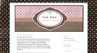
For my part, at Almost Ready Blogs, I try to accommodate the issues surrounding screen and resolution sizes by keeping my backgrounds focused on one or two beautiful patterns, adding few to no elements and using a large background image. I add all the fun stuff like bows and ribbons in the headers that I offer. I also make a point to give a screen shot of the final layout on a real blog so readers can see what it looks like “in action”. Of course, it will only look like that screen shot if your monitor is the same as my monitor, but we could just go in circles with that issue all.day.long.
And with that, I’m out of time. I hope these tutorials find you well and prosperous, or at least in the mood to play around on your computer for a bit.
BONUS TUTORIAL SITE:
I just found this site (and by just found I mean less than zero seconds ago) called Blogging Basics 101. Looks good. You check it out. I’ll check it out. The blathering we’ll save for another day.
Dawn Farias makes free Blogger layouts at Almost Ready Blogs.


