25% Off All Classes This Week Only

December 20, 2011 By The Blog Designer Network

We are right in the middle of a fancy re-design and getting ready to announce who the new instructors will be for the New Year!  Come take a look at the new logo, and pop back in each day this week to see the updates. We are also celebrating the holidays by offering a 25% discount off ALL courses when you register this week only. Just use the code CHRISTMAS at checkout.  Courses below are scheduled in January, and a video copy is provided if you’re unable to make the live session. Please don’t hesitate to contact us if you have any questions about the courses. Just use our contact link above!

25% off code: CHRISTMAS

Use Decorative Letters to Spice-Up Your Posts

February 16, 2010 By The Blog Designer Network

e-4-cap-4316558 very post deserves some “pop” doesn’t it? Often times we use photos to help break up the monotony of just text. However, I came across an Jessica Hische, an extremely talented graphic designer.

Daily Drop Cap is a project she started in September of 2009 in which she illustrates a decorative letter every day (or at least every work day). The project will continue for approximately twelve alphabets and are available for non-commercial use as drop caps on your personal blog. Please visit dailydropcap.com to see the full project.

I jumped right on over to the Daily Drop Cap and found the letter I wanted to use for this post, followed her instructions and there you go. It was so easy!! The letters are beautiful and charming and would be a lovely accent to most any blog post.

n-4-cap-8071864 ot all are swirly and feminine.

o-2-cap-8558208 thers are modern or retro.

y-2-cap-6869170 ou are certain to find one that suites you to a tee.

t-3-cap-1659465 hese are free, but for personal use only.

signaturecopy-3-3334679

Birthday Bash Weekend – Second Giveaway

January 23, 2010 By The Blog Designer Network

This giveaway is now closed, winners listed at the bottom.

Continuing on with Beautiful Blog Designs’s Birthday Bash Weekend, I am giving away a $15 gift certificate to Adori Graphics.

bloglink-1-4780785

Louise, the designer at Adori Graphics, became a supporter of BBD only a few months after I created it. She has since become a blogging friend and I think she is one of the kindest, most generous designer/bloggers out there. I have enjoyed seeing her talent and business grow over the past year and can’t wait to see where it goes in 2010. Louise is another designer who creates her own graphics, so you don’t have to worry about anyone else having the same images as you.

Now, if you already have the blog design you want, still enter this giveaway. Louise has a plethora of products and services you could use your gift certificate for, including digital scrapbook kits, watermarks, business cards, Twitter backgrounds, Etsy banners and so much more. 

Giveaway guidelines:

  • To enter simply leave a comment telling me how long you’ve been blogging
  • If you do not have your email linked to your blogging profile, please leave it in the comment
  • Only one entry per person
  • Giveaway ends Sunday, January 24th at 11:00 PM EST
  • You must claim your prize via email to Louise within a week or it will be awarded to another blogger

THE WINNER(S)

The winning number was comment #7, by Kirstie! And, because she’s my sister and it make look funny that she won, I’m giving away a second gift certificate and that winning number is #1 by Emmy. Congratulations to you both!

Random Integer Generator

Here are your random numbers:

7 

Timestamp: 2010-01-26 05:03:43 UTC

Random Integer Generator

Here are your random numbers:

1 

Timestamp: 2010-01-26 05:05:59 UTC

signaturecopy-3-7204637

Beautiful Blog Series: Chez Larsson

February 22, 2010 By The Blog Designer Network

Guest post by Marianne from Songbird

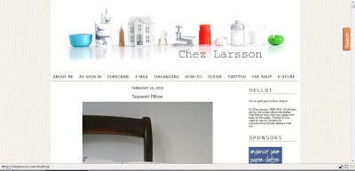
For this weeks Beautiful Blog feature we are guests at Chez Larsson, in Sweden. Benita is in her own words “a neat freak, an organizing enthusiast and someone who truly enjoys getting her hands dirty”. On her beautiful blog she shares many organizing and decorating tricks and proves that she and her husband and son are real DIY professionals.

chezlarssonscreenprint-1512161

What I love about Chez Larsson:

  • Uncluttered and easy to navigate design
  • Lovely banner picture that communicates the content of the blog very well
  • Easy to read posts with beautiful big photograps
  • Helpful navigational bar with all the right links
  • Cleverly positioned Search tool
  • The blog design is a clear reflection of the Larsson’s personal style

At the Larsson’s (that is what Chez Larsson means) you will see a family who loves DIY and crafts and who run the most organized and uncluttered house I have ever seen. Benita always makes me want to go clean up my house (and to get me to want to do that is a miracle). I love how their homemade blog design, is a true reflection of their lifestyle. Go check out their Beautiful Blog Design and have fun looking at all the amazing DIY projects they have done and benefit from all the fun and easy organizing tips. And tell them we sent you.

Benita, you have a beautiful blog and beautiful followers who love you! If you would like to share this feature with your readers, here is a button for a post or sidebar.

finalfeaturebuttoncopy-4254398

signaturecopy-3-5428628

Designer Blogs

April 11, 2011 By Designer Blogs

The “Link Within” gadget is a great way for your readers to read related posts. So let’s show you how to add it to YOUR blog! Step 1:Start by vising the Link Within website. Found HERE. (this is what it will look like)  Step 2: You will then enter your information:Step 3: The website will […]

April 7, 2011 By Designer Blogs

Do you love the look of Polaroid photos? There is just something so cool about retro Polaroids, am I right or am I right?! Well today I’m going to show you how to give your post images a similar look. Step 1. Log in to your Blogger account. In the dashboard click “design” Step 2. […]

Social Media Mastery Class this Wednesday

January 16, 2012 By The Blog Designer Network

We’re very excited to offer this new class on Wednesday evening.  Both designers and bloggers will benefit from this course on making social media both beautiful and functional. Whether you use social media often, use one more than others, or are a total newbie – this course includes everything you need, and you can attend right from your computer at home!  Begins Wednesday, January 18th at 5:30pm MT (Mountain Time) and lasts until 7:30pm.  Read below for details, or register here.

socialmediamastery1-5063665

mesmall-150x150-5061184 Instructor:  April Durham

Bio:  As a blog and website designer, April has not only created social media graphics for many clients, but has also grown her social media presence in the process.  With over 4,300 Twitter followers, 2,200 Facebook likes, and 807 Pinterest followers, April has built a community around her business and can help you to do the same.  You can follow her @aprildurham on Twitter and Pinterest.

This class includes:

  • A video copy of the course to keep and watch. (Viewable on Mac and PC.)
  • Over 5 templates to download and use to create your own images.
  • A comprehensive e-Book of detailed notes.

Here are some of the things the course will cover:

  • Creating graphics
    • Best formats and dimensions for each platform
    • Social Icons for your site
    • Facebook Cover Photos *NEW*
    • Facebook Profile Images
    • Facebook Landing Pages
    • Twitter Backgrounds
    • Twitter Avatars
    • Pin-worthy graphics
  • Building a targeted fan-base
  • Using social media management tools to simplify managing many sites
  • Incorporating social media into your blog or website
  • Tips and techniques for Facebook and Twitter updates.

PLUS
Using the *NEW* Pinterest to your advantage (without spamming your loyal followers!)
and more!

Other courses April teaches this month:
The Blog Designer Workshop
Adobe Photoshop (Intermediate/Advanced)

Courses by other teachers this month:
Creating Genesis Child Themes by Lynne of Visual Serendipity
Blogging on WordPress.org (for Beginners) by Jessica of The Frilly Coconut
Blog Header in Adobe Photoshop Elements by Jessica of The Frilly Coconut

Register Here (Price: $65)

Have questions? Send inquires to info (at) thebdn (dot) com or use our “Contact” page!

Useful Links for Designers

April 3, 2011 By The Blog Designer Network

Don’t Do These 5 Dirty Design Deeds

Don’t do these 5 dirty design deeds

http://sixrevisions.com/web_design/negative-space-in-webpage-layouts-a-guide/

Negative Space in Webpage Layouts: A Guide

Mega Collection Of Cheatsheets for Designers & Developers

Mega Collection of Cheatsheets for Designers & Developers

http://sixrevisions.com/web_design/how-to-stay-ahead-of-the-curve-as-a-designer/

How to Stay Ahead of the Curve as a Designer

http://www.patterncooler.com/

A Free Seamless Pattern Backroung Design Resource

Free Fonts: 100+ Fresh and Free High-Quality Fonts

Free Fonts: 100+ Fresh and Free High-Quality Fonts

http://webdesigneraid.com/5-awesome-things-that-you-can-do-with-css3/

5 Awesome Things That You Can Do with CSS3

http://www.noupe.com/graphics/design-charts-for-better-typography-and-color.html

Desgin Charts for Better Typography and Color

http://www.wpchildthemes.com/plugin/genesis-footer

Genesis Footer

http://webdesign.tutsplus.com/articles/designing-in-browser-a-manifesto/

Designing In-Browers: A Manifesto

http://www.inc.com/magazine/20110301/making-money-small-business-advice-from-jason-fried.html

How to Get Good at Making Money

http://lostandtaken.com/gallery

Texture Gallery

http://wordpressreviewplugins.com/

Turning WordPress Into an Affiliate Review Site is Easy…If You Use the Right Plugin!

http://designshack.co.uk/articles/layouts/10-tips-for-troubleshooting-a-lackluster-design

10 Tips for Troubleshooting Lackluster Design

Workshop: A Better WordPress for your Clients by Troy Dean at WordCamp Melbourne 2011

Workshop: A Better WordPress for your Clients

http://blog.typekit.com/2011/03/17/type-study-typographic-hierarchy/

Type Study: Typographic Hierarchy

http://www.prelovac.com/vladimir/

Organic Search Optimization Strategy for 2011

http://cssmenumaker.com/

CSS Menu Generator

http://www.tehkseven.net/news/475-free-vector-icons

475 Free Vector Icons

http://www.graphicleftovers.com/

Graphic Leftovers (Vector Images)

http://picketfenceblogs.com/

Picket Fence Blogs

http://www.smashingmagazine.com/2011/03/14/technical-web-typography-guidelines-and-techniques/

Technical Web Typography: Guidelines and Techniques

http://wpcandy.com/made/the-sample-post-collection

Easier Theme Development with Sample WordPress Content

http://depositphotos.com/

Deposit Photos (Vector Images)

http://codex.wordpress.org/Template_Hierarchy

Template Hierarchy

http://www.quackit.com/html/codes/html_email_code.cfm

HTML Email Code

Host your own SIFR fonts (Video)

http://tutsplus.com/

tuts+

Web Nerd Terminology (Explained)

CSS Tricks

http://makincuteblogs.com/2011/02/20-awesome-high-resolution-texture-freebies/

20 Awesome High Resolution Texture Freebies!

The Pros and Cons of Art Directed Blog Posts

The Pors and Cons of Art Directed Blog Posts

Free Fonts

Kevin & Amanda Fonts

* http://www.kevinandamanda.com/fonts/freescrapbookfonts/ — Scrapbook
* http://kevinandamanda.com/fonts/fontsforpeas/ — Pea Fonts

http://www.dafont.com/

http://misstiina.com/fonts/

http://www.1001freefonts.com/

http://www.urbanfonts.com/

http://www.sugarfrogfonts.com/

http://new.myfonts.com/

http://www.letteringdelights.com/

http://www.fontsquirrel.com/- Commercial free

http://www.google.com/webfonts

Beautiful Blog Series: Good n Crazy

April 19, 2010 By The Blog Designer Network

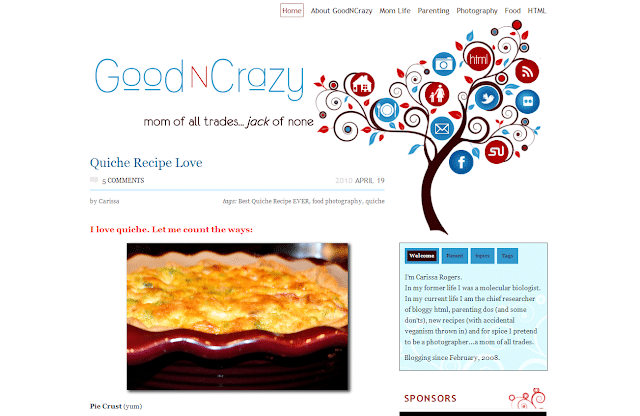
This week’s Beautiful Blog feature is a WordPress.org blog called GoodNCrazy.The owner, Carissa, is an amazing woman -in her life prior to motherhood and blogging, she was a molecular biologist (WOW!) but now enjoys writing at GoodNCrazy about her family, photography, parenting, food and more.

goodncrazy-3345619

What I love about GoodNCrazy:

  • Amazing, unique header! Love the navigation buttons built right into it.
  • Very user friendly with a navigation menu above the header and categories in the sidebar.
  • Clean, uncluttered sidebars.
  • Engaging, informative About page (too many bloggers don’t have this and it is important).
  • Lots of white space which is easy on the reader’s eyes.
  • Great content, which is broken into bite size paragraphs with pictures to keep readers engaged.

Dappled Studios is the design team who created this brilliant design for Carissa. They are certainly very talented and their work is exceptional.

Congratulations, Carissa, for having such a beautiful blog! If you’d like to share this feature with your readers, here is a button for a post or sidebar.

finalfeaturebuttoncopy-2392181

    signaturecopy-3-5342440

Five things to consider BEFORE you start to work on your blog design

January 27, 2010 By The Blog Designer Network

Guest post by Marianne

Hi there! My name is Marianne and I blog about my life, my creative adventures and my love for nesting at Songbird. I am a DIY girl, who loves to get her hands dirty and experiment with power tools. I am also DIY when it comes to blog design. A couple of months ago I gave my blog a total makeover and Amanda invited me, after giving my blog design her two thumbs up (thanks Amanda!), to share some of my insights and experiences with homemade blog designing.

We home and craft loving gals are a visual bunch, aren’t we? We want our homes and creative products to be as beautiful as possible. And since our blog is our home on the web, most of us really want our blog to be as eye pleasing as possible too.

Of course there are many talented and gifted women out there who have specialized in giving your blog a makeover and making it really beautiful. But rightfully so, these women like to get paid for their creative talent and their hard work. If you are like me, a hobby blogger whose blog doesn’t generate any income (yet), paying someone to work on your blog may not really be in your budget. So you are left to you own devices to make your blog more beautiful. And trust me, it can be done!

But before we dive into the world of blog templates, HTML coding and navigational bars, lets do some groundwork first. Just like when you are considering to give a thrift shop find a makeover: before you can get your paintbrush out and decide on the paint color you are going to use, you have to consider the way you are intending to use the piece, if it is needing repairs and how many layers of old chippy paint and dirt you have to remove first.

The same principle applies to blog design. Before you start concentrating on the pictures you are going to use in your header and the color scheme of your blog there are five things you have to think about first:

1. Your blog is for your readers.

I know you are all tempted to say ‘no I blog just for me, because I like it’. But lets face it girls if we really only blogged for ourselves we wouldn’t make our blog public, we would keep it a private (online) journal. We all want other people to read our blog and admire and enjoy our hard work. So whenever you are considering doing anything to your blog, ask yourself first if that will make the blogging experience for your readers more pleasant. Your blog design should include all the elements that make your blog really useful and usable to your readers.

2. What does your blog mean?

I think if you asked most women in our home and garden blog niche why they love blogging they would answer two things: because of the inspiration it gives them and second because of the community it makes them feel a part of. You and your blog are part of that community. So your blog design should be aimed at showcasing your projects and ideas, so that they provide maximum inspiration (lot’s of BIG pictures is one element of this) and at the same time give your visitor’s a sense that they are truly welcome and that it is fun visiting with you.

3. Clutter is clutter, even when it is the online kind.

Ever wonder why those pictures in design magazines always look so beautiful, even when they do not resemble your style? It is because of the lack of clutter. You might see a carefully draped blanket somewhere, or a casually forgotten book on a chair (with a coordinating cover color of course!), but you will never see hundreds of knickknacks, leftover breakfast dishes or dirty socks in those pictures.

If you consider the blog designs you like best, I bet that they are pretty clutter free also. There are so many gadgets, and widgets and funny buttons available to add to our blogs these days. It is really tempting to fill up your sidebars with all of them. But often they are just clutter. Clutter that is distracting your readers from your content and might even make your blog really slow to load. So when considering to add another cutesy button remember the first rule: your blog is for your readers, will adding it make you blog more useful or usable?.

4. Your blog is a reflection of you.

When I started to give my blog a makeover I started the way I start any project. I looked at the way others have done it. So I started to make a list of blogs, whose design I liked and then I started to break it down. What kind of layout did I like best, which banner drew me in the most, when did the size of the font or the pictures feel too small, which elements did I find very useful (or annoying). And then I started to try and incorporate those elements in my blog (or in some cases remove them from my existing design). When I thought I was nearly finished I asked a friend for her opinion and her reply made me almost start over completely. She said, “I like it, it looks very good, but it doesn’t look like you anymore”. And she was right, I was making a blog design like all the others. It wasn’t ‘me’ anymore. So I worked on it a lot longer, making it less like a beautiful online ‘house’ and more like my personal online ‘home’.

5. Embrace the challenge, but keep it real.

If you would have unlimited time you could make your blog the most beautiful blog in the world. There is always another design element you could add, a functionality you could improve or an opportunity to add even more beauty to your design. But if you did that, you wouldn’t have any time to blog anymore. And no matter how beautiful the design of your blog is, people come to visit you for your content. Content comes first, design comes second. So do step into the world of HTML coding, it is not as difficult as you might think, but keep your expectations real. Fiddling with your blog design can be addictive (ask me how I know that) but if it starts to interfere with your actual blogging it is counterproductive.

Marianne@Songbird is a DIY girl all the way even when it comes to blogdesign. She shares her successes and mistakes in her DIY attempts to make her Songbird blog more beautiful.

Beautiful Blog Design Series: 30 Handmade Days

November 1, 2010 By The Blog Designer Network

30days-button-8127536

This week’s Beautiful Blog Design feature goes to 30 Handmade Days, a Blogger site run by Mique. 30 Handmade Days is dedicated to all things handmade, through tutorials, giveaways and features.

What I love about 30 Days Handmade’s blog:

  • Pleasing, easy-on-the-eyes color scheme.
  • Simple but niche-related design* that hits the spot perfectly!
  • Navbar that helps readers navigate the blog easier.
  • Tidy, uncluttered side bars.
  • Font in post area that is easy to read.
  • Content in posting area is broken into bite-size chunks.
  • Sweet About page to readers can connect with the Mique.
  • Icons for social media and email are at the top and easy to find.

*The talented designer behind Mique’s lovely design is Sharon at Redbud Designs.

I recently met Mique online and I want to say that she is as sweet and sincere as her blog and design are, a perfect combination! No wonder she has so many wonderful blog friends and followers!

If you appreciate handmade crafts or make them yourself, I highly recommend heading over the 30 Handmade Days, view the beautiful blog design and enjoy browsing through the giveaways and tutorials she has available.