Beautiful Blog Series: Good n Crazy

April 19, 2010 By The Blog Designer Network

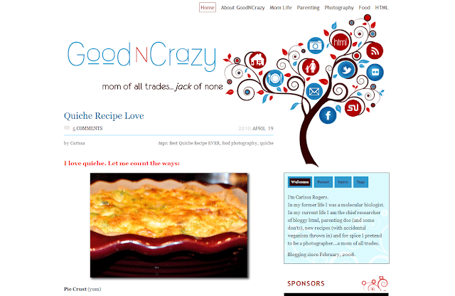
This week’s Beautiful Blog feature is a WordPress.org blog called GoodNCrazy.The owner, Carissa, is an amazing woman -in her life prior to motherhood and blogging, she was a molecular biologist (WOW!) but now enjoys writing at GoodNCrazy about her family, photography, parenting, food and more.

goodncrazy-3345619

What I love about GoodNCrazy:

  • Amazing, unique header! Love the navigation buttons built right into it.
  • Very user friendly with a navigation menu above the header and categories in the sidebar.
  • Clean, uncluttered sidebars.
  • Engaging, informative About page (too many bloggers don’t have this and it is important).
  • Lots of white space which is easy on the reader’s eyes.
  • Great content, which is broken into bite size paragraphs with pictures to keep readers engaged.

Dappled Studios is the design team who created this brilliant design for Carissa. They are certainly very talented and their work is exceptional.

Congratulations, Carissa, for having such a beautiful blog! If you’d like to share this feature with your readers, here is a button for a post or sidebar.

finalfeaturebuttoncopy-2392181

    signaturecopy-3-5342440

Five things to consider BEFORE you start to work on your blog design

January 27, 2010 By The Blog Designer Network

Guest post by Marianne

Hi there! My name is Marianne and I blog about my life, my creative adventures and my love for nesting at Songbird. I am a DIY girl, who loves to get her hands dirty and experiment with power tools. I am also DIY when it comes to blog design. A couple of months ago I gave my blog a total makeover and Amanda invited me, after giving my blog design her two thumbs up (thanks Amanda!), to share some of my insights and experiences with homemade blog designing.

We home and craft loving gals are a visual bunch, aren’t we? We want our homes and creative products to be as beautiful as possible. And since our blog is our home on the web, most of us really want our blog to be as eye pleasing as possible too.

Of course there are many talented and gifted women out there who have specialized in giving your blog a makeover and making it really beautiful. But rightfully so, these women like to get paid for their creative talent and their hard work. If you are like me, a hobby blogger whose blog doesn’t generate any income (yet), paying someone to work on your blog may not really be in your budget. So you are left to you own devices to make your blog more beautiful. And trust me, it can be done!

But before we dive into the world of blog templates, HTML coding and navigational bars, lets do some groundwork first. Just like when you are considering to give a thrift shop find a makeover: before you can get your paintbrush out and decide on the paint color you are going to use, you have to consider the way you are intending to use the piece, if it is needing repairs and how many layers of old chippy paint and dirt you have to remove first.

The same principle applies to blog design. Before you start concentrating on the pictures you are going to use in your header and the color scheme of your blog there are five things you have to think about first:

1. Your blog is for your readers.

I know you are all tempted to say ‘no I blog just for me, because I like it’. But lets face it girls if we really only blogged for ourselves we wouldn’t make our blog public, we would keep it a private (online) journal. We all want other people to read our blog and admire and enjoy our hard work. So whenever you are considering doing anything to your blog, ask yourself first if that will make the blogging experience for your readers more pleasant. Your blog design should include all the elements that make your blog really useful and usable to your readers.

2. What does your blog mean?

I think if you asked most women in our home and garden blog niche why they love blogging they would answer two things: because of the inspiration it gives them and second because of the community it makes them feel a part of. You and your blog are part of that community. So your blog design should be aimed at showcasing your projects and ideas, so that they provide maximum inspiration (lot’s of BIG pictures is one element of this) and at the same time give your visitor’s a sense that they are truly welcome and that it is fun visiting with you.

3. Clutter is clutter, even when it is the online kind.

Ever wonder why those pictures in design magazines always look so beautiful, even when they do not resemble your style? It is because of the lack of clutter. You might see a carefully draped blanket somewhere, or a casually forgotten book on a chair (with a coordinating cover color of course!), but you will never see hundreds of knickknacks, leftover breakfast dishes or dirty socks in those pictures.

If you consider the blog designs you like best, I bet that they are pretty clutter free also. There are so many gadgets, and widgets and funny buttons available to add to our blogs these days. It is really tempting to fill up your sidebars with all of them. But often they are just clutter. Clutter that is distracting your readers from your content and might even make your blog really slow to load. So when considering to add another cutesy button remember the first rule: your blog is for your readers, will adding it make you blog more useful or usable?.

4. Your blog is a reflection of you.

When I started to give my blog a makeover I started the way I start any project. I looked at the way others have done it. So I started to make a list of blogs, whose design I liked and then I started to break it down. What kind of layout did I like best, which banner drew me in the most, when did the size of the font or the pictures feel too small, which elements did I find very useful (or annoying). And then I started to try and incorporate those elements in my blog (or in some cases remove them from my existing design). When I thought I was nearly finished I asked a friend for her opinion and her reply made me almost start over completely. She said, “I like it, it looks very good, but it doesn’t look like you anymore”. And she was right, I was making a blog design like all the others. It wasn’t ‘me’ anymore. So I worked on it a lot longer, making it less like a beautiful online ‘house’ and more like my personal online ‘home’.

5. Embrace the challenge, but keep it real.

If you would have unlimited time you could make your blog the most beautiful blog in the world. There is always another design element you could add, a functionality you could improve or an opportunity to add even more beauty to your design. But if you did that, you wouldn’t have any time to blog anymore. And no matter how beautiful the design of your blog is, people come to visit you for your content. Content comes first, design comes second. So do step into the world of HTML coding, it is not as difficult as you might think, but keep your expectations real. Fiddling with your blog design can be addictive (ask me how I know that) but if it starts to interfere with your actual blogging it is counterproductive.

Marianne@Songbird is a DIY girl all the way even when it comes to blogdesign. She shares her successes and mistakes in her DIY attempts to make her Songbird blog more beautiful.
Beautiful Blog Design Series: 30 Handmade Days

November 1, 2010 By The Blog Designer Network

30days-button-8127536

This week’s Beautiful Blog Design feature goes to 30 Handmade Days, a Blogger site run by Mique. 30 Handmade Days is dedicated to all things handmade, through tutorials, giveaways and features.

What I love about 30 Days Handmade’s blog:

  • Pleasing, easy-on-the-eyes color scheme.
  • Simple but niche-related design* that hits the spot perfectly!
  • Navbar that helps readers navigate the blog easier.
  • Tidy, uncluttered side bars.
  • Font in post area that is easy to read.
  • Content in posting area is broken into bite-size chunks.
  • Sweet About page to readers can connect with the Mique.
  • Icons for social media and email are at the top and easy to find.

*The talented designer behind Mique’s lovely design is Sharon at Redbud Designs.

I recently met Mique online and I want to say that she is as sweet and sincere as her blog and design are, a perfect combination! No wonder she has so many wonderful blog friends and followers!

If you appreciate handmade crafts or make them yourself, I highly recommend heading over the 30 Handmade Days, view the beautiful blog design and enjoy browsing through the giveaways and tutorials she has available.

Beautiful Blog Series: My Two Seasons

May 10, 2010 By The Blog Designer Network

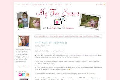
Today’s Beautiful Blog is My Two Seasons, a self-hosted WordPress blog run by Michelle Johnson. My Two Seasons is a place for Michelle to share her love of photography, nature and family. Her photography is beautiful and inspiring, and I find myself drawn back there time and again.

mytwoseasons-2767018

The design for My Two Seasons was recently created by Michelle herself and I think it is just fantastic!

What I love about the design:

  • Clean and simple design, with plenty of white space
  • Tidy, well organized sidebar
  • User friendly navbar at the top of the blog
  • Simple, but very tasteful header with rotating pictures
  • Soothing color scheme
  • Great content!

If you have some time to blog hop today, I highly recommend popping over to My Two Seasons. You’ll find yourself staying longer than you thought you would!

Congratulations, Michelle, on having such a beautiful blog! If you’d like to share this feature with your readers, here is a button for your sidebar or a blog post.

finalfeaturebuttoncopy-4509479

If you’d like to see all the past Beautiful Blog Series features, simply click on Beautiful Blog Series in the Categories section in the sidebar.

p.s. Don’t forget about the giveaway going on right now. Two budget blog makeovers by Adori Graphics; to enter click here.
signaturecopy-3-6344784

Custom Blog Design Giveaway!!

January 26, 2010 By The Blog Designer Network

This giveaway is now closed.

Congratulations to the winner, Summer, comment #17, from Lady Luck’s Abode! 

(I usually paste in the Random.org part here, but I exited out of the page and can’t get back. It was #17, I promise LOL).
 

Today we have the Grand Prize to finish off the birthday bash for Beautiful Blog Designs and I am very excited to be hosting a giving away for a custom blog design by 7M Designs!

th_7mbutton-6241633

Kim, the designer at 7M Designs, has decided to reinvent her design business this year, and she started off by giving it a new name. The design business was formerly BB Blog Design, but she renamed it 7M (after her personal blog, The 7 Millers) to incorporate all her design work including Christmas cards, birth announcements, web sites and more.

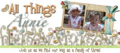
Here are a few of her designs that I love:

allthingsannie1-1598150

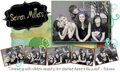
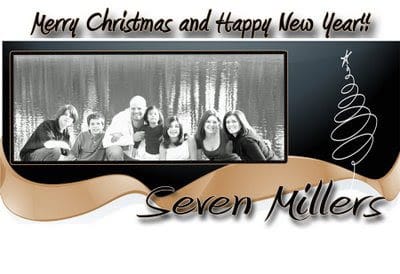
sevenmillersheader-9748859   millerchristmasheader-1269623

I love that right when BBD is celebrating the anniversary of it’s launch, we are helping a designer celebrate the relaunch of her business. That’s why I keep Beautiful Blog Designs going, to aid bloggers and designers – it just feels good!

The prize for this giveaway is a custom blog design that includes:

  • Custom header
  • Backgrounds
  • Custom sidebar tabs (up to 5)
  • Custom signature
  • Installation (of course)

Here are the giveaway specifics:

  1. To enter simply leave a comment telling me what your blog is about (food, photography, homeschooling, crafts, a mixture, etc.).
  2. Earn a second entry by going to Kim’s portfolio and coming back here to tell me your favorite design. Make sure to leave your answer in another comment.
  3. The giveaway runs from Tuesday until Thursday, January 28th at 11:00 PM EST.
  4. The winner will be chosen via Random.org and she has one week to claim their prize via email to Kim or a new winner will be chosen.

signaturecopy-3-5348849

Beautiful Blog Series: The Homeschool Chick

June 21, 2010 By The Blog Designer Network

button1252-1695773

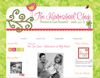
Today I am featuring a Blogger blog, The Homeschool Chick, a blog run by Sue, a homeschooling mom who writes about homeschooling, her faith, photography, blogging and the little things that tickle her.

homeschoolchick-2197900

What I love about The Homeschool Chick:

  • Clean, cute design that is fresh and cheerful.
  • Lots of white space, which is easier on the reader’s eyes.
  • Very well organized sidebars, with important things like how to contact and follow up top for the readers to find.
  • Creative and engaging About page.
  • Well written posts with text broken into smaller chunks, easier for the readers to follow.
  • Pictures with most posts, which help to engage the reader and illustrate the point of the post.

The Homeschool Chick was designed by Designer Blogs, the design studio who created BBD’s look also. They are so wonderful and I love the look they created for Sue.

Congratulations, Sue, on having such a beautiful blog! Here is a button if you’d like to share this feature with your readers.

finalfeaturebuttoncopy-5817630

It’s been a few weeks since my last Beautiful Blog Feature. Even though the features don’t seem to get many comments, I do get lots of feedback about them via emails or on Twitter, so I keep doing them. Also, I think it is good for new bloggers to see what a beautiful blog consists of, because it’s not all about the design.

If you’d like to see all the past Beautiful Blog Series features, simply click on Beautiful Blog Series in the Categories section in the sidebar.
signaturecopy-3-3706455

Make Your Pictures Prettier – For FREE

February 3, 2010 By The Blog Designer Network

At first glace this post may not seem to fit with the direction and purpose of Beautiful Blog Designs, but it does so bear with me.

Everyone knows, or should know, that adding pictures to your blog posts really helps gain the reader’s attention and sometimes helps explain crafts, tutorials and more. Everyone on the planet knows about the Pioneer Woman, right? Her pictures are amazing, entertaining and educating. Her shots used for her recipes help take the mystery out of cooking. Or, what about A Soft Place to Land? She has wonderful craft ideas and always share several pictures so that her readers can see the craft, step by step.

Now, before adding those pictures to your posts, make sure they look as good as they can. Regardless if you use a point and shoot camera or a DSLR, editing your pictures can make a world of difference. A hugely popular program is Photoshop, but it comes with a huge price tag. A stripped-down version of it is Photoshop Elements, which is much more affordable.

Now, if you don’t have a editing program, no worries. There are several free ones you can use online (do a Google search and you’ll find many). One that come highly recommended is Picnik.com. And before you fuss about not having to learn how to use it, there is an excellent post at TidyMom about it today. She describes how she edits her photos, makes collages and adds words to pictures.

tidymom20button150-9707121

Do you use a free online editor? If so, I’d love to hear about it. Leave the program and the address and I’ll add it to this post.

Here are some recommended by BBD readers:

Thank you, SueAnn, Elizabeth and Emmy for taking a moment to share with us what works for you.

signaturecopy-3-4989616

New MyGrafico Affiliate Program!

August 17, 2011 By The Blog Designer Network

If you’ve ever used digital art from MYGRAFICO ARTS & CRAFTS you know how affordable their amazing graphics are, and how useful they are when designing blogs and websites!  From detailed patterned backgrounds, to cute frames for blog headers, and even high quality clipart – the variety found at their newly re-designed website is just one of the reasons to take a look!  Plus their prices are just unbeatable!  Most of the items come with commercial license options and can be used by blog designers, web designers, print designers, and more.

capturemygrafico-7244939

They also have implemented an affiliate program where you can earn money by referring your blog readers and even design clients.  Track your clicks and earnings, and have a variety of options when it comes to promoting this great and resourceful site!  We have been avid MyGrafico fans for quite awhile, so we jumped at the chance to become affiliates too!

*The affiliate links in this post may generate a small commission for the BDN.  We appreciate your support!*

How to Schedule Blog Posts in Blogger

April 3, 2011 By April M

Sometimes I would like to schedule when my new post will show on my blog at a certain date and time instead of me having to go in and post it manually. Here is how to do that:

Step 1: After you have created a post click on “Post Options” under “Labels”.

Step 2: Choose “Scheduled at” under “Post date and time”. Enter the date and time you would like your post to show on your blog.

Step 3: Click “Publish Post” and wah-la!

Blog Design Giveaways

October 23, 2010 By The Blog Designer Network

bbd-button-1616357

Bloggy Blog Desigz is teaming up with another designer on October 30th and giving away design goodies every hour of the day, from 10AM to 4PM via TWITTER! Read this POST to see how to enter. It’s very simple and sounds like lots of fun!

**************************************************

Blog Designers: Do you have a blog design giveaway going on that you would like Beautiful Blog Designs to publicize? Simply use the contact form to send me the HTML code for your button and main details of your giveaway.